Usability Testing
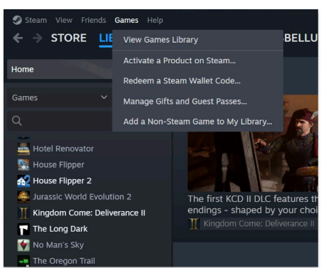
Steam Desktop App
Image via Steam.com
Skills & Competencies
Usability Testing
Heuristic Evaluation
Information Architecture
UX Research & Analysis
Critical Thinking
Visual Communication
About this project
This project evaluated the Steam desktop app’s navigation and interface using Nielsen’s heuristics and user testing feedback. The goal was to identify where users encounter confusion and to provide design recommendations that improve clarity, consistency, and flow.
Context & Purpose
This project evaluated the usability of the Steam desktop app to understand how users navigate its complex interface.
Steam’s large feature set made it a strong case for studying organization, labeling, and interaction flow within a live digital product.
Purpose:
- Identify navigation and usability issues through structured analysis.
- Apply heuristic evaluation and open card sorting to assess interface clarity.
- Practice translating research findings into actionable design insights.
Process & Methods
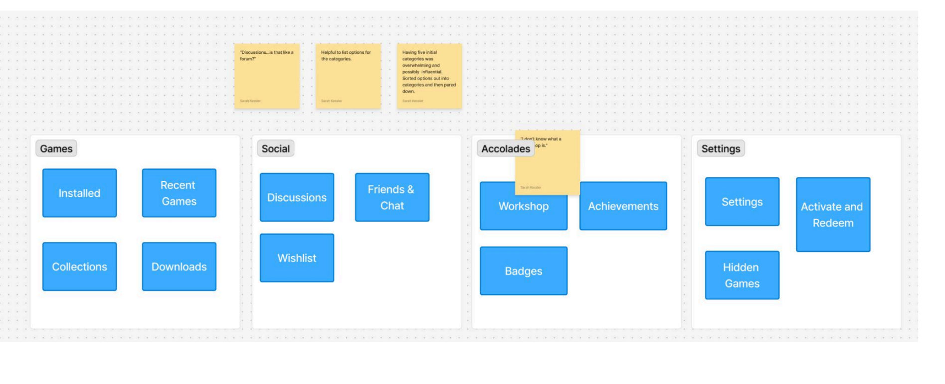
I used both heuristic evaluation and open card sorting to analyze the Steam desktop app’s navigation and interface. These methods helped identify how users interpret menu structure, where confusion occurs, and how the system aligns with established usability principles.
Steps:
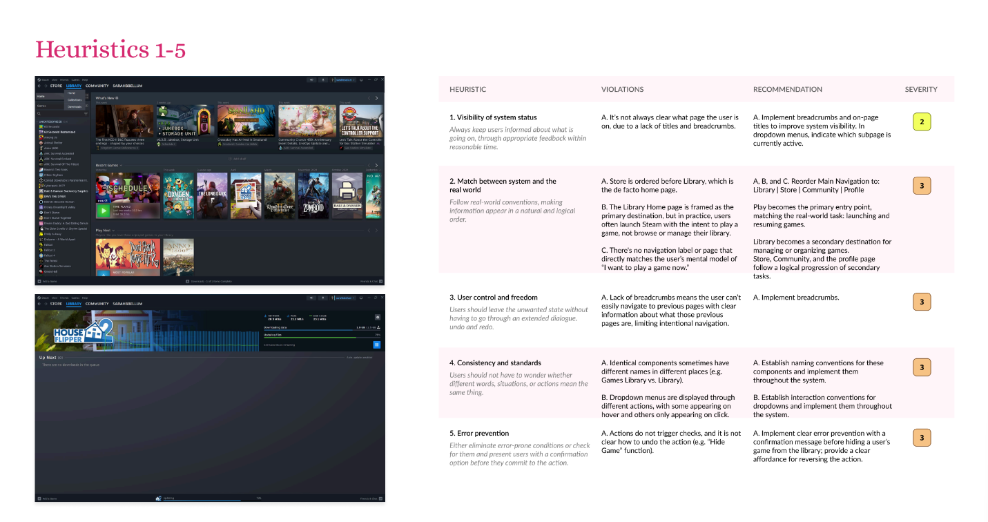
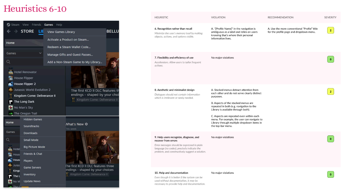
- Conducted a heuristic evaluation using Nielsen’s 10 usability principles to assess interface consistency, visibility, and feedback.
- Designed and ran an open card sort to test how users grouped and labeled key menu items.
- Recorded and synthesized findings to highlight recurring navigation and terminology issues.
- Organized insights in a structured report with visual examples and clear recommendations.
See full evaluation with annotations on Figma
Findings
The evaluation revealed several key usability and navigation issues that affected how efficiently users could locate and understand features within the Steam desktop app.
Key Findings:
- Inconsistent labeling across menus caused confusion and slowed task completion.
- Overlapping categories made it difficult for users to predict where certain actions or settings were located.
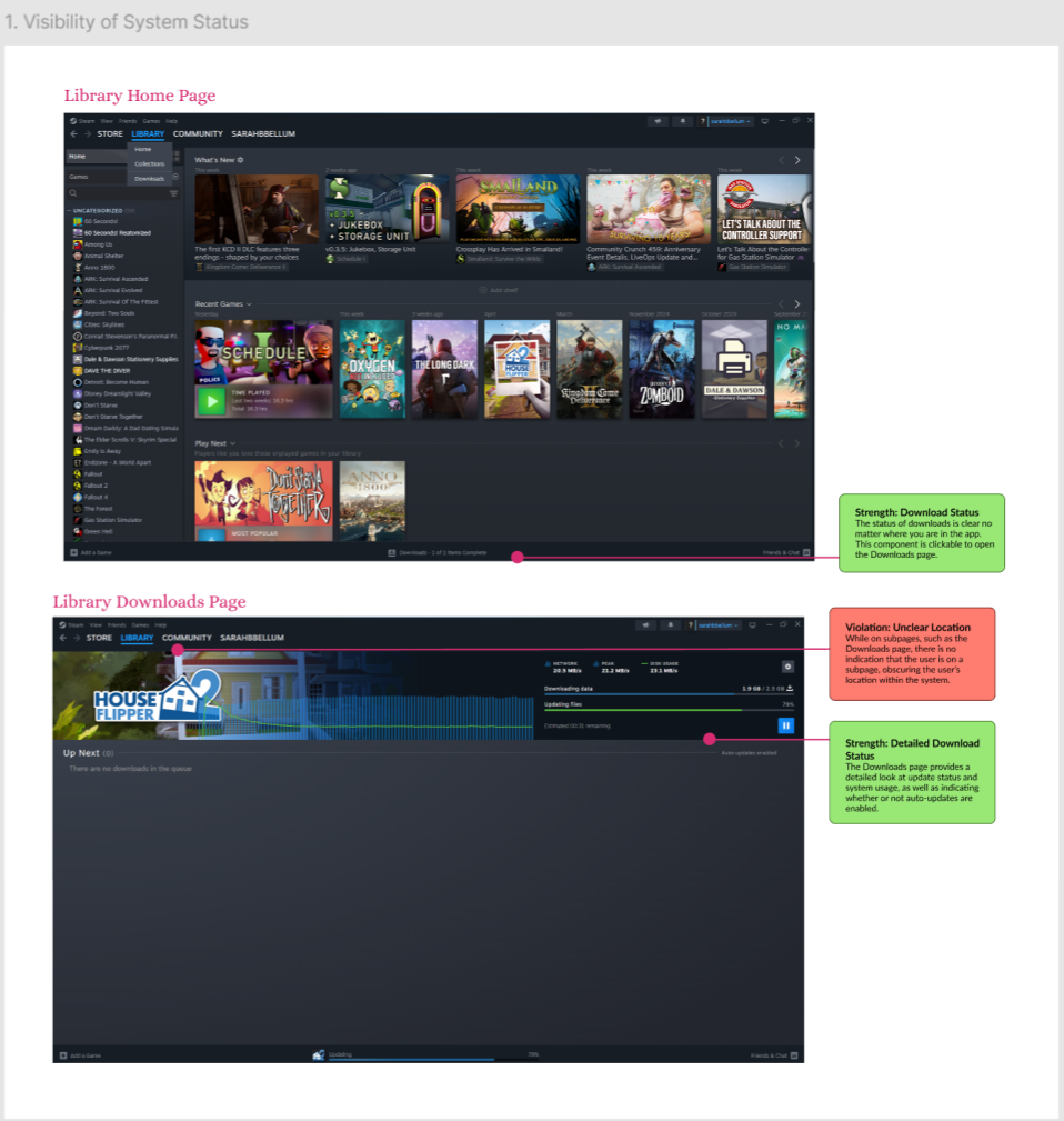
- Limited visual feedback left users uncertain whether actions (like downloads or updates) were in progress.
- Cluttered navigation panels contributed to cognitive overload, especially for new users.
- Unclear hierarchy between primary and secondary menu options made key features harder to find.
Insights:
- Streamlining menu categories and standardizing terminology would improve orientation and flow.
- Adding visual indicators and progressive feedback could reduce uncertainty during task execution.
Recommendations
Based on the findings, I proposed design and structural improvements to enhance clarity, reduce friction, and create a more intuitive user experience.
01
Standardize Terminology
Menu items used inconsistent naming conventions, making navigation unpredictable. Unifying terms across the interface would help users quickly recognize and understand functions.
02
Simplify Menu Structure
Several categories overlapped or contained redundant options. Consolidating these sections would reduce cognitive load and make it easier for users to locate common features.
03
Strengthen Visual Feedback
Users often couldn’t tell when an action was in progress or complete. Adding progress indicators and subtle animations would build trust and improve overall clarity.
04
Clarify Hierarchy and Emphasis
The visual weight of primary and secondary menu items was inconsistent. Adjusting spacing, typography, and grouping would guide users more effectively through key actions.
Reflection & Summary
Steam’s desktop app is massive—full of menus, tabs, and hidden features that longtime users know by heart but newcomers often stumble through.
This project took a closer look at that experience, using heuristic evaluation and open card sorting in FigJam to pinpoint where navigation starts to feel more like guesswork than play.
The research revealed a familiar story in UX: too many overlapping categories, vague labels, and almost no feedback when actions were in progress.
The fun part was translating those patterns into design fixes—clarifying hierarchy, cleaning up terminology, and giving users subtle cues that say, “Yes, something’s happening.”
Built and synthesized in Figma, the final report showed how small interface tweaks can make a complex platform like Steam feel smoother and more intuitive without losing its character.
Related Projects