Improved Travel Site
Wireframes and Hi-Fi Designs
Skills & Competencies
Wireframing & Visual Design
Content Design & UX Writing
Information Architecture
Accessibility & Readability
Interaction Design
About This Project
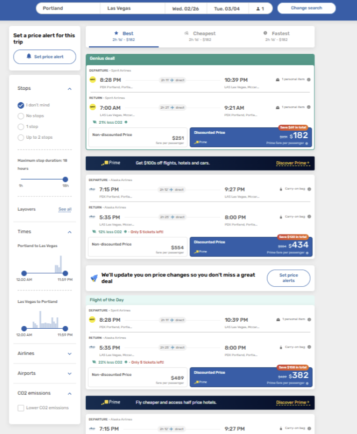
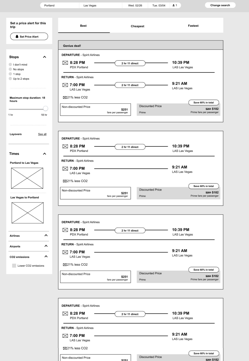
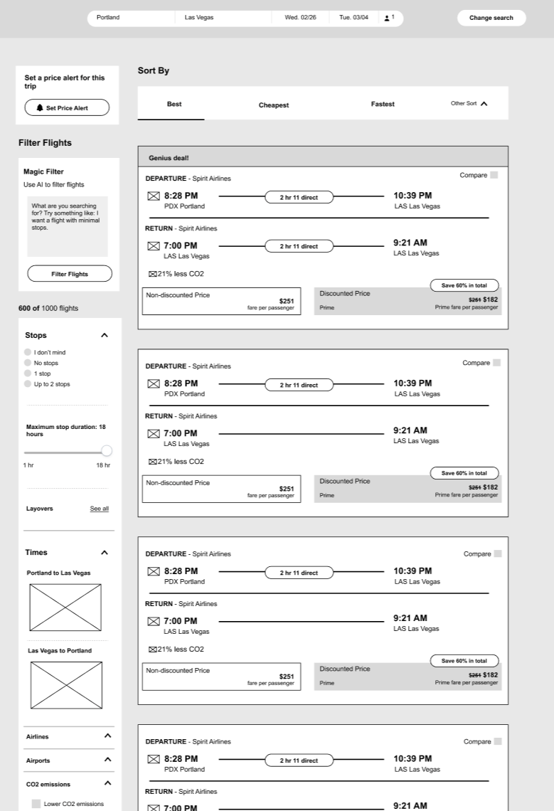
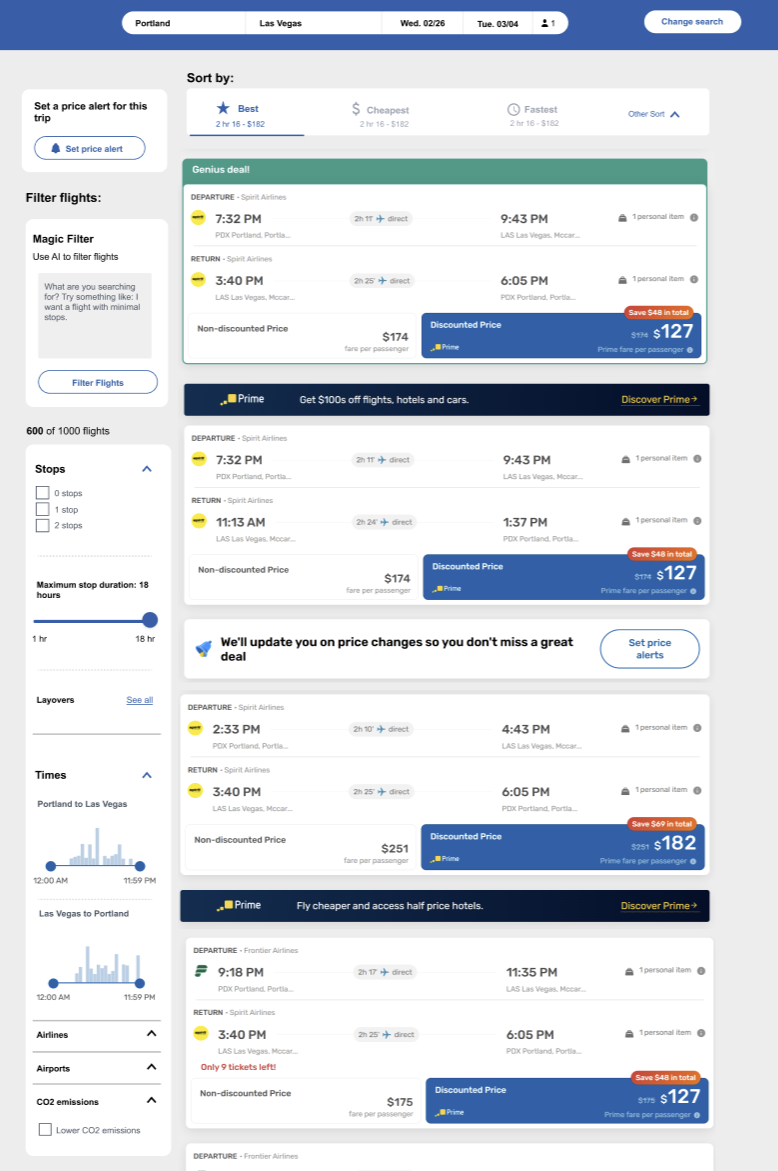
This project reimagined a cluttered travel booking interface with a cleaner, more intuitive layout. The redesign began with low-fidelity wireframes to establish visual hierarchy and alignment, then evolved into a set of high-fidelity screens focused on readability, simplicity, and accessibility.
Context & Purpose
The original site presented users with an overwhelming interface, competing visual elements, and inconsistent spacing. The project aimed to redesign the layout to better support clarity and user decision-making.
Purpose:
- Identify and correct key usability and visual hierarchy issues.
- Improve alignment, spacing, and typography for cleaner presentation.
- Establish a consistent visual system across all screens.
- Create designs that balance aesthetics and usability for faster task flow.
Process & Methods
The redesign process focused on structural refinement and visual clarity, using wireframes to test layout logic before developing high-fidelity screens.
Steps:
- Reviewed the original site to document pain points related to hierarchy, spacing, and visual noise.
- Created wireframes exploring cleaner grid alignment and reduced cognitive load.
- Applied consistent design logic across form fields, buttons, and filters.
- Designed high-fidelity screens emphasizing legibility, spacing, and contrast.
- Evaluated the visual flow to ensure key functions were prioritized and easy to locate.
Findings
Comparing the original and redesigned versions revealed how structured hierarchy and visual consistency improved usability and overall aesthetic appeal.
Key Findings:
- Visual clutter: The original layout’s competing buttons and banners distracted from the main search task.
- Poor grouping: Filters and results lacked visual relationships, making scanning inefficient.
- Inconsistent hierarchy: Important fields like dates and stops were visually buried.
- Low contrast: Insufficient color and font contrast reduced legibility.
Takeaways
Designing Nomad reinforced how curiosity and usability can coexist within a digital product. By grounding visual decisions in user research, the project balanced emotional engagement with functional clarity.
01
Hierarchy Shapes Behavior
Reordering and spacing elements around the primary task helped users complete searches more confidently and quickly.
02
Whitespace Creates Focus
Using generous spacing and consistent alignment reduced cognitive strain and made the layout feel open and organized.
03
Consistency Builds Credibility
Standardizing visual patterns across buttons, cards, and filters created a more trustworthy, professional design.
04
Accessibility Enhances Aesthetics
Improved contrast ratios and legible typography enhanced usability while elevating the overall look and feel.
Reflection
This project demonstrated how strong layout structure and hierarchy can transform a dense interface into an inviting, usable design.
Reworking the travel site from wireframes to high-fidelity screens reinforced the importance of restraint—using whitespace, alignment, and consistent styling to let the content lead.
The final designs show how clarity and accessibility aren’t separate from aesthetics, but the foundation of them.
Related Projects