Nomad Travel App
Research, Wireframes, and Hi-Fi Designs
Skills & Competencies
UX Research
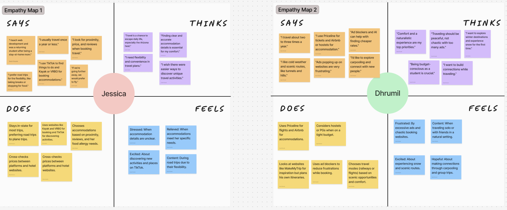
Empathy Mapping
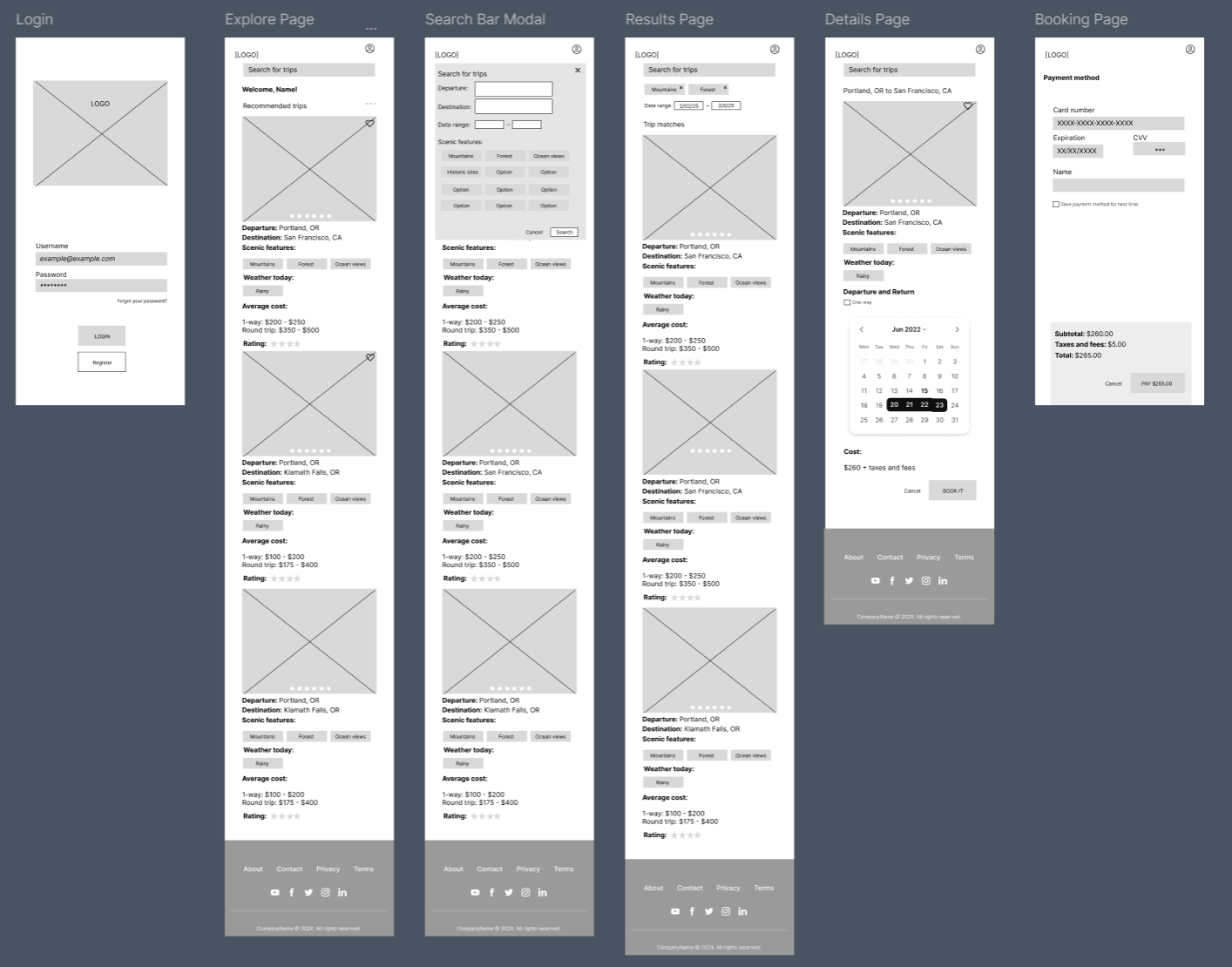
Wireframing & Prototyping
Information Architecture
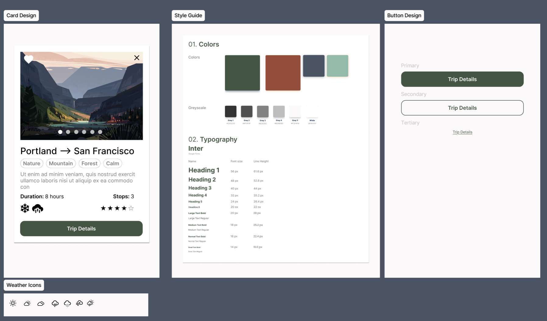
Visual Design & Style Guide Creation
Interaction Design
About This Project
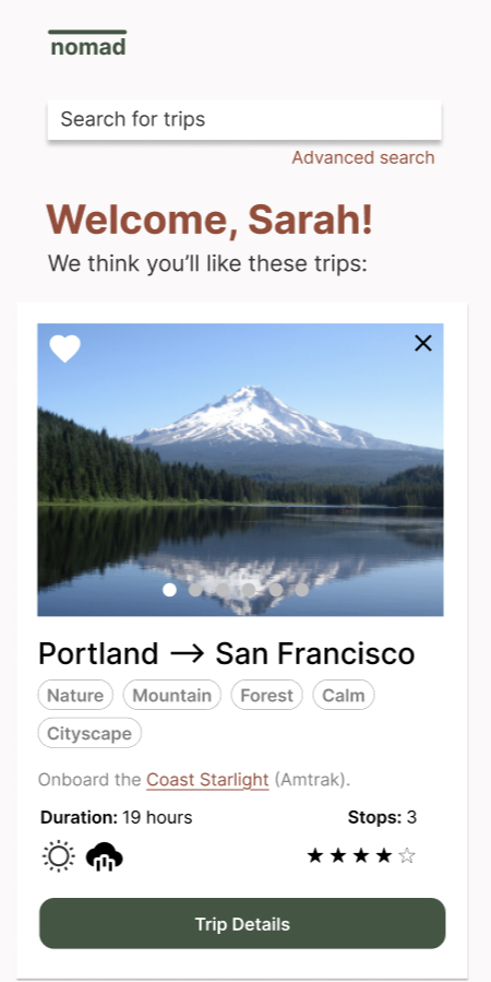
The Nomad Travel App was designed to help users discover and book scenic train journeys. The project began with user research and empathy mapping to understand travel motivations and frustrations, followed by low-fidelity wireframes and a polished high-fidelity design. The result was a cohesive, user-centered concept focused on exploration, ease of use, and emotional connection to travel.
Context & Purpose
The project explored how travelers search for scenic and meaningful travel experiences rather than the fastest routes. Research findings guided the app’s focus on curiosity, inspiration, and simplicity.
Purpose:
- Understand what motivates users to choose scenic travel.
- Identify usability issues in existing trip-planning tools.
- Create an interface that emphasizes exploration and discovery.
- Integrate research insights into design decisions for flow and hierarchy.
Process & Methods
The project followed a full UX design process from research to prototype, using both analytical and creative methods to shape the final product.
Steps:
- Conducted empathy mapping to capture travel motivations, goals, and frustrations.
- Analyzed existing travel platforms to identify common usability gaps.
- Created user flows and low-fidelity wireframes focused on simple navigation.
- Designed a visual style guide for consistency and brand identity.
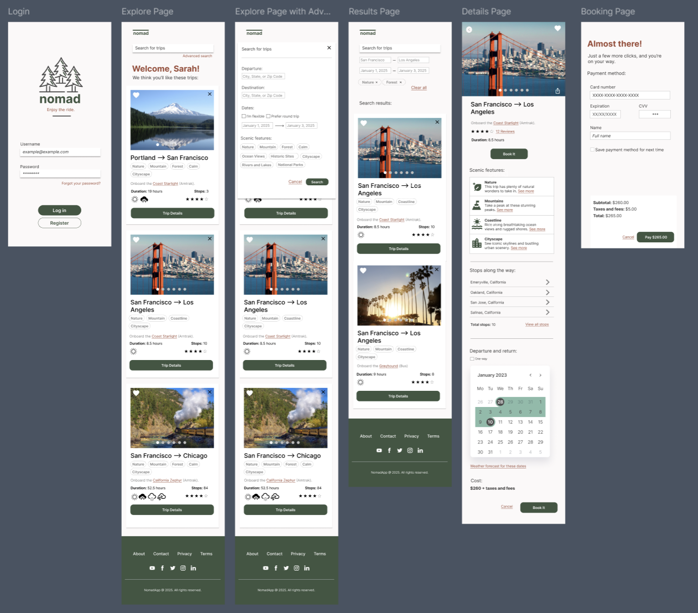
- Developed high-fidelity prototypes in Figma, applying accessibility and hierarchy principles.
View Full Analyses on Figjam:
Findings
Research and early testing revealed key design opportunities for improving how users browse and plan scenic travel routes.
Key Findings:
- Overwhelming interfaces: Competing visual elements made users lose focus on discovery.
- Lack of emotional connection: Existing sites prioritized logistics over inspiration.
- Poor flow between research and booking: Users struggled to transition from browsing to planning.
- Weak feedback cues: Users wanted reassurance that preferences and filters were saved.
View Design Files on Figma:
Takeaways
Designing Nomad reinforced how curiosity and usability can coexist within a digital product. By grounding visual decisions in user research, the project balanced emotional engagement with functional clarity.
01
Research Shapes Empathy
Early user mapping revealed that travel decisions are driven more by emotion and curiosity than logistics, guiding the app’s focus on inspiration over efficiency.
02
Simplicity Encourages Exploration
Reducing visual noise and clarifying hierarchy helped users engage with content naturally, making discovery feel effortless.
03
Details Define Trust
Small cues—like confirmation states and saved routes—built user confidence and reinforced a sense of reliability.
04
A Cohesive System Builds Delight
Maintaining a consistent color palette, tone, and spacing across screens created visual rhythm and brand unity throughout the experience.
Reflection
This project reinforced how thoughtful research and clear design systems can turn a simple idea into a cohesive user experience.
Nomad became a study in balancing inspiration with usability—proving that emotional engagement and functional clarity aren’t opposing forces, but complementary ones.
The result was a design that feels exploratory yet grounded, giving users a sense of control while inviting curiosity.
Related Projects